
Abstract
This study confirms the significant impact of smoking on the escalation of health insurance premiums. Male and female smokers with a body mass index (BMI) of 30 or higher face additional charges, compounding their financial burden. Male smokers experience a 52% increase, while female smokers face a 49% rise in insurance charges, in addition to the base premium for smokers.
Moreover, male smokers pay 408.57\% more than non-smokers, while female smokers pay 350.12\% more. The data unequivocally supports the idea that unhealthy lifestyle choices, such as smoking and high BMI, result in higher health insurance premiums. It is also evident that premiums increase gradually with age.
While this project provides valuable insights, further exploration opportunities include applying machine learning techniques to assess the representativeness of the sample, which could enhance the accuracy of conclusions and drive advancements in health insurance research.
Data Setup and Import
Code
import matplotlib.pyplot as plt
import seaborn as sns
import numpy as np
import pandas as pd
from scipy import stats

sns.set_style('darkgrid')
sns.set(font_scale=1.2)

# Read the CSV file
df = pd.read_csv("/data/insurance.csv")

df.head()| age | sex | bmi | children | smoker | region | charges | |
|---|---|---|---|---|---|---|---|
| 0 | 19 | female | 27.900 | 0 | yes | southwest | 16884.92400 |
| 1 | 18 | male | 33.770 | 1 | no | southeast | 1725.55230 |
| 2 | 28 | male | 33.000 | 3 | no | southeast | 4449.46200 |
| 3 | 33 | male | 22.705 | 0 | no | northwest | 21984.47061 |
| 4 | 32 | male | 28.880 | 0 | no | northwest | 3866.85520 |
High-Level Exploratory Analysis
We start by exploring the dataset at a high level: checking for missing data, data types, and general statistics.
Code
print("Dataset Info:")
print(df.info())
print("\nBasic Description:")
print(df.describe(include='all'))
Dataset Info:
<class 'pandas.core.frame.DataFrame'>
RangeIndex: 1338 entries, 0 to 1337
Data columns (total 7 columns):
# Column Non-Null Count Dtype
--- ------ -------------- -----
0 age 1338 non-null int64
1 sex 1338 non-null object
2 bmi 1338 non-null float64
3 children 1338 non-null int64
4 smoker 1338 non-null object
5 region 1338 non-null object
6 charges 1338 non-null float64
dtypes: float64(2), int64(2), object(3)
memory usage: 73.3+ KB
None
Basic Description:
age sex bmi children smoker region \
count 1338.000000 1338 1338.000000 1338.000000 1338 1338
unique NaN 2 NaN NaN 2 4
top NaN male NaN NaN no southeast
freq NaN 676 NaN NaN 1064 364
mean 39.207025 NaN 30.663397 1.094918 NaN NaN
std 14.049960 NaN 6.098187 1.205493 NaN NaN
min 18.000000 NaN 15.960000 0.000000 NaN NaN
25% 27.000000 NaN 26.296250 0.000000 NaN NaN
50% 39.000000 NaN 30.400000 1.000000 NaN NaN
75% 51.000000 NaN 34.693750 2.000000 NaN NaN
max 64.000000 NaN 53.130000 5.000000 NaN NaN
charges
count 1338.000000
unique NaN
top NaN
freq NaN
mean 13270.422265
std 12110.011237
min 1121.873900
25% 4740.287150
50% 9382.033000
75% 16639.912515
max 63770.428010 Distribution of Smokers vs. Non-Smokers
Code
# Count the number of smokers vs. non-smokers
num_smokers = (df["smoker"] == "yes").sum()
num_nonsmokers = (df["smoker"] == "no").sum()

print(f"Number of smokers: {num_smokers}")
print(f"Number of nonsmokers: {num_nonsmokers}")

plt.figure(figsize=(6, 4))
sns.countplot(x="smoker", data=df)
plt.title("Count of Smokers vs. Non-smokers")
plt.xlabel("Smoking Status")
plt.ylabel("Count")
plt.tight_layout()
plt.show()
Number of smokers: 274
Number of nonsmokers: 1064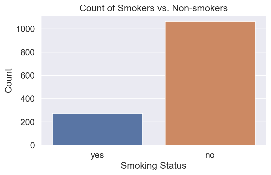
Analysis of Factors Affecting Insurance Costs
We now focus on identifying the relationship between smoking status and insurance charges. We also investigate gender differences, BMI (Body Mass Index), age, and other features.
Code
print("Overall mean charges:", round(df['charges'].mean(), 2))
print("Overall median charges:", round(df['charges'].median(), 2))
print("Overall standard deviation:", round(df['charges'].std(), 2))
Overall mean charges: 13270.42
Overall median charges: 9382.03
Overall standard deviation: 12110.01Insurance Costs: Smokers Only
Boxplot and Histogram
Code
df_smokers = df[df["smoker"] == "yes"]

fig, (ax1, ax2) = plt.subplots(1, 2, figsize=(10, 5))

sns.boxplot(y="charges", data=df_smokers, ax=ax1)
ax1.set_title("Insurance Cost Boxplot (Smokers)")
ax1.set_ylabel("Insurance Cost (USD)")

sns.histplot(df_smokers["charges"], bins=40, kde=True, ax=ax2)
ax2.set_title("Insurance Cost Distribution (Smokers)")
ax2.set_xlabel("Insurance Cost (USD)")

plt.tight_layout()
plt.show()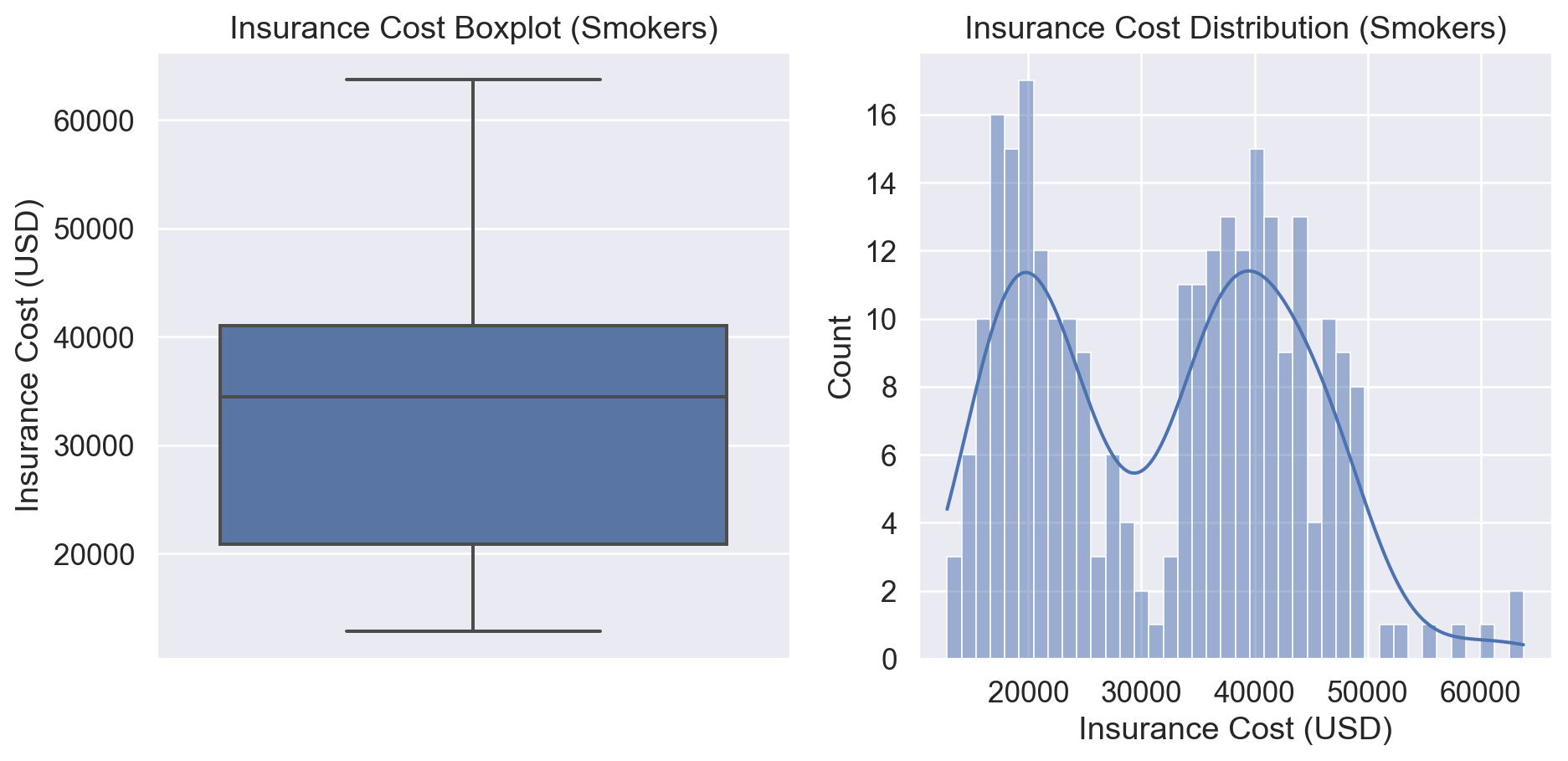
Summary Statistics (Smokers)
Code
smoker_mean = round(df_smokers["charges"].mean(), 2)
smoker_median = round(df_smokers["charges"].median(), 2)
smoker_std = round(df_smokers["charges"].std(), 2)
smoker_var = round(df_smokers["charges"].var(), 2)
smoker_max = round(df_smokers["charges"].max(), 2)
smoker_min = round(df_smokers["charges"].min(), 2)

print(f"Smoker Mean: ${smoker_mean}")
print(f"Smoker Median: ${smoker_median}")
print(f"Smoker Max: ${smoker_max}")
print(f"Smoker Min: ${smoker_min}")
print(f"Smoker Std: ${smoker_std}")
print(f"Smoker Var: {smoker_var}")
Smoker Mean: $32050.23
Smoker Median: $34456.35
Smoker Max: $63770.43
Smoker Min: $12829.46
Smoker Std: $11541.55
Smoker Var: 133207311.21Male vs. Female Smokers
Below we compare male smokers and female smokers, highlighting BMI and how it affects insurance cost.
Code
df_male_smoker = df_smokers[df_smokers["sex"] == "male"]
df_female_smoker = df_smokers[df_smokers["sex"] == "female"]

# Plot multiple subplots for male smokers
fig, ax = plt.subplots(2, 3, figsize=(14, 8))
sns.set(font_scale=0.9)

# 1) Histogram of charges (male smokers)
sns.histplot(df_male_smoker["charges"], bins=40, ax=ax[0,0], color="navy")
ax[0,0].set_title("Male Smoker Cost Dist.")
ax[0,0].set_xlabel("Cost (USD)")

# 2) Bar plot of average charges by children
df_children_m = (
    df_male_smoker
    .groupby("children")["charges"]
    .mean()
    .reset_index()
)
sns.barplot(data=df_children_m, x="children", y="charges", ax=ax[0,1], color="teal")
ax[0,1].set_title("Avg. Male Smoker Cost by # of Children")
ax[0,1].set_xlabel("Number of Children")
ax[0,1].set_ylabel("Cost (USD)")

# 3) Scatterplot charges vs BMI
sns.scatterplot(
    data=df_male_smoker, x="bmi", y="charges",
    hue="region", ax=ax[0,2]
)
ax[0,2].axvline(x=30, color="gray", linestyle="--", label="BMI = 30")
ax[0,2].set_title("Male Smoker: Cost vs. BMI")
ax[0,2].set_xlabel("BMI")
ax[0,2].set_ylabel("Cost (USD)")

# 4) Scatterplot charges vs age
sns.scatterplot(
    data=df_male_smoker, x="age", y="charges",
    hue="children", ax=ax[1,0]
)
ax[1,0].set_title("Male Smoker: Cost vs. Age")
ax[1,0].set_xlabel("Age")
ax[1,0].set_ylabel("Cost (USD)")

# 5) Barplot average cost by region
df_region_m = (
    df_male_smoker
    .groupby("region")["charges"]
    .mean()
    .reset_index()
)
sns.barplot(data=df_region_m, x="region", y="charges", ax=ax[1,1], palette="viridis")
ax[1,1].set_title("Male Smoker Cost by Region")
ax[1,1].set_xlabel("Region")
ax[1,1].set_ylabel("Cost (USD)")

# 6) Boxplot
sns.boxplot(x=df_male_smoker["charges"], ax=ax[1,2], color="lightblue")
ax[1,2].set_title("Male Smoker: Boxplot of Charges")
ax[1,2].set_xlabel("Cost (USD)")

plt.tight_layout()
plt.show()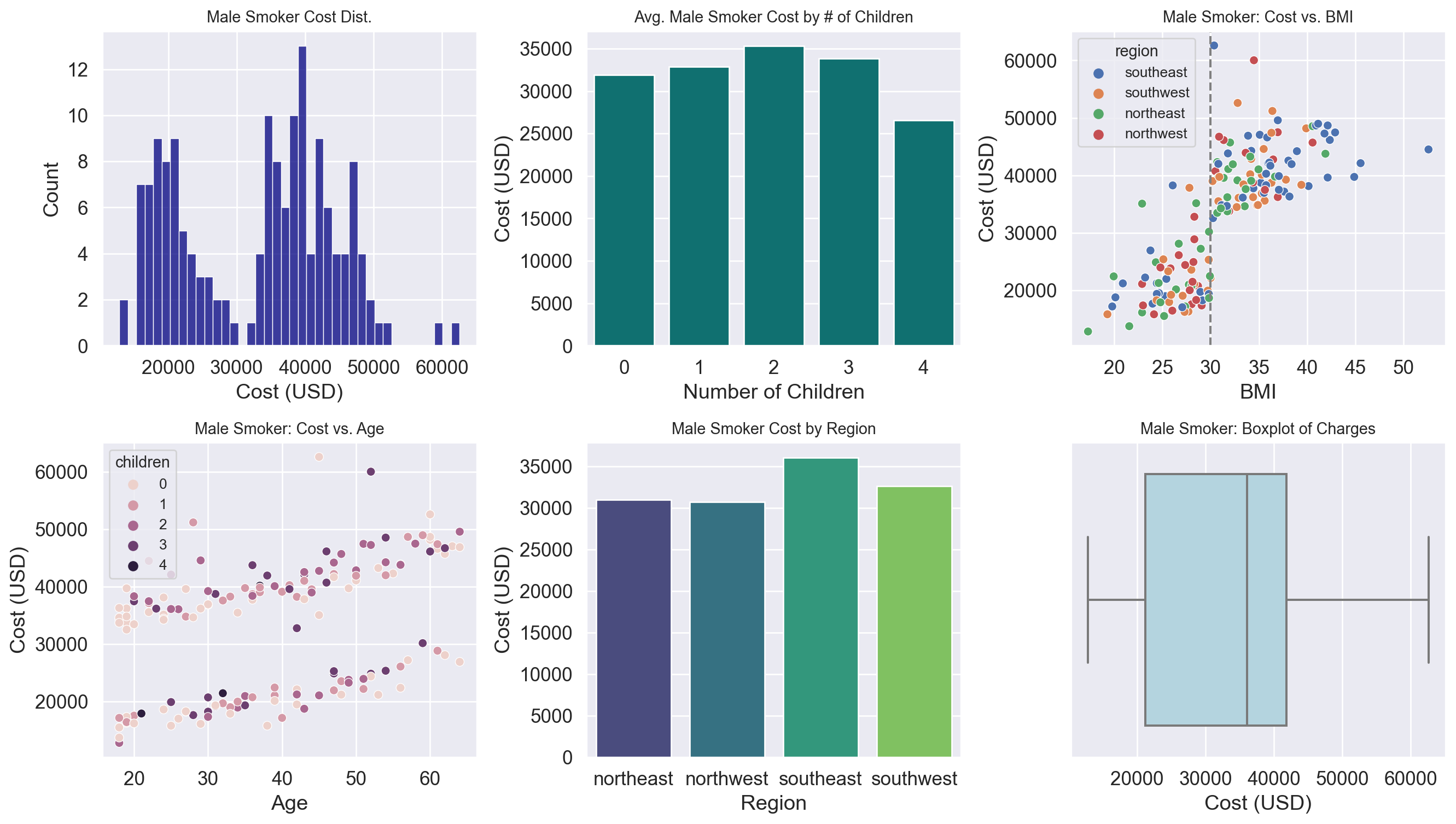
BMI < 30 vs. BMI >= 30 (Male Smokers)
Code
male_bmi_under_30 = df_male_smoker[df_male_smoker["bmi"] < 30]
male_bmi_over_30 = df_male_smoker[df_male_smoker["bmi"] >= 30]

avg_under_30 = round(male_bmi_under_30["charges"].mean(), 2)
avg_over_30 = round(male_bmi_over_30["charges"].mean(), 2)
diff_male = round(avg_over_30 - avg_under_30, 2)
rel_increase_male = 100 * round(diff_male / avg_under_30, 2)

print(f"Male Smoker <30 BMI Avg. Cost: ${avg_under_30}")
print(f"Male Smoker >=30 BMI Avg. Cost: ${avg_over_30}")
print(f"Absolute Difference: ${diff_male}")
print(f"Relative Increase: ~{rel_increase_male}% higher cost")
Male Smoker <30 BMI Avg. Cost: $21643.07
Male Smoker >=30 BMI Avg. Cost: $41131.57
Absolute Difference: $19488.5
Relative Increase: ~90.0% higher costFemale Smokers
Code
fig, ax = plt.subplots(2, 3, figsize=(14, 8))
sns.set(font_scale=0.9)

# 1) Histogram
sns.histplot(df_female_smoker["charges"], bins=40, ax=ax[0,0], color="purple")
ax[0,0].set_title("Female Smoker Cost Dist.")
ax[0,0].set_xlabel("Cost (USD)")

# 2) Barplot average cost by children
df_children_f = (
    df_female_smoker
    .groupby("children")["charges"]
    .mean()
    .reset_index()
)
sns.barplot(data=df_children_f, x="children", y="charges", ax=ax[0,1], color="violet")
ax[0,1].set_title("Avg. Female Smoker Cost by # of Children")
ax[0,1].set_xlabel("Number of Children")
ax[0,1].set_ylabel("Cost (USD)")

# 3) Scatterplot cost vs BMI
sns.scatterplot(
    data=df_female_smoker, x="bmi", y="charges",
    hue="region", ax=ax[0,2]
)
ax[0,2].axvline(x=30, color="gray", linestyle="--")
ax[0,2].set_title("Female Smoker: Cost vs. BMI")
ax[0,2].set_xlabel("BMI")
ax[0,2].set_ylabel("Cost (USD)")

# 4) Scatterplot cost vs age
sns.scatterplot(
    data=df_female_smoker, x="age", y="charges",
    hue="children", ax=ax[1,0]
)
ax[1,0].set_title("Female Smoker: Cost vs. Age")
ax[1,0].set_xlabel("Age")
ax[1,0].set_ylabel("Cost (USD)")

# 5) Barplot by region
df_region_f = (
    df_female_smoker
    .groupby("region")["charges"]
    .mean()
    .reset_index()
)
sns.barplot(data=df_region_f, x="region", y="charges", ax=ax[1,1], palette="rocket")
ax[1,1].set_title("Female Smoker Cost by Region")
ax[1,1].set_xlabel("Region")
ax[1,1].set_ylabel("Cost (USD)")

# 6) Boxplot
sns.boxplot(x=df_female_smoker["charges"], ax=ax[1,2], color="pink")
ax[1,2].set_title("Female Smoker: Boxplot of Charges")
ax[1,2].set_xlabel("Cost (USD)")

plt.tight_layout()
plt.show()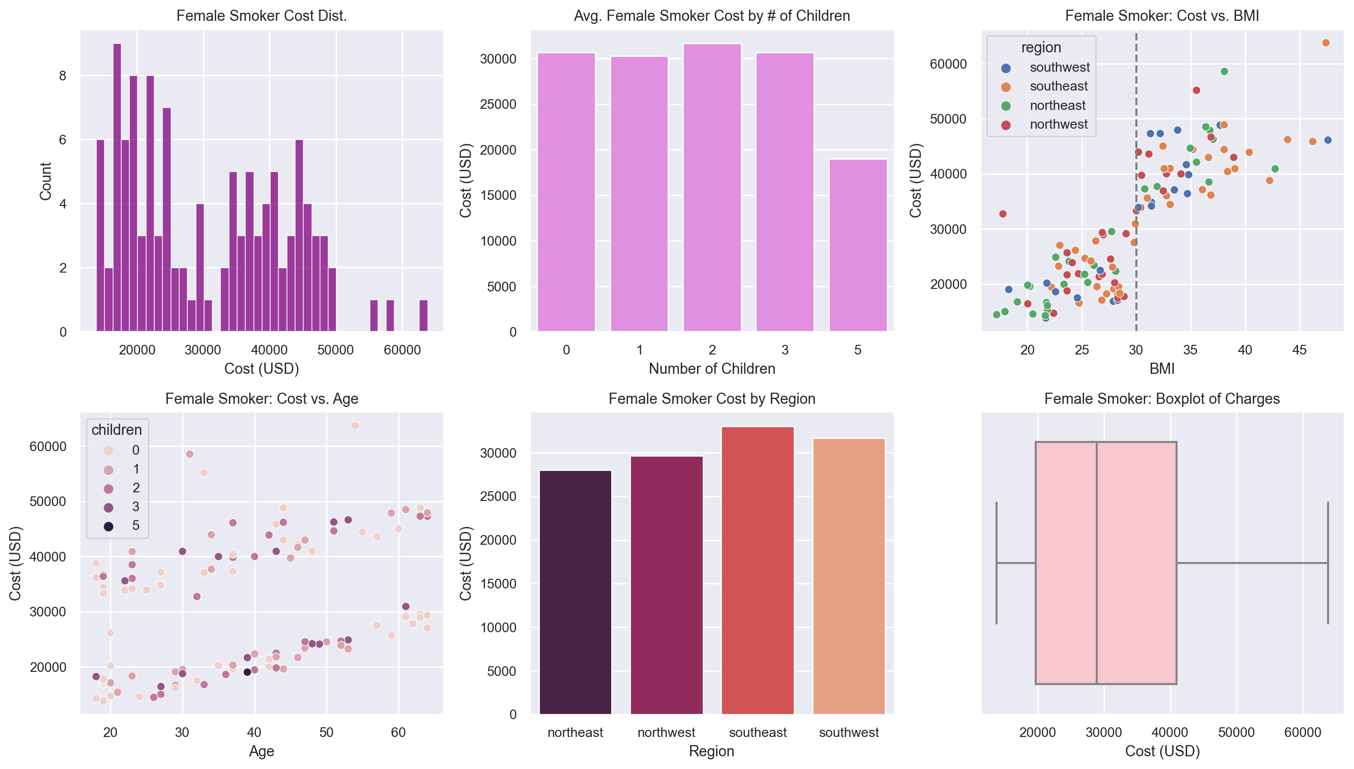
Code
female_bmi_under_30 = df_female_smoker[df_female_smoker["bmi"] < 30]
female_bmi_over_30 = df_female_smoker[df_female_smoker["bmi"] >= 30]

avg_under_30_f = round(female_bmi_under_30["charges"].mean(), 2)
avg_over_30_f = round(female_bmi_over_30["charges"].mean(), 2)
diff_female = round(avg_over_30_f - avg_under_30_f, 2)
rel_increase_female = 100 * round(diff_female / avg_under_30_f, 2)

print(f"Female Smoker <30 BMI Avg. Cost: ${avg_under_30_f}")
print(f"Female Smoker >=30 BMI Avg. Cost: ${avg_over_30_f}")
print(f"Absolute Difference: ${diff_female}")
print(f"Relative Increase: ~{rel_increase_female}% higher cost")
Female Smoker <30 BMI Avg. Cost: $21070.04
Female Smoker >=30 BMI Avg. Cost: $42320.62
Absolute Difference: $21250.58
Relative Increase: ~101.0% higher costSmokers vs. Non-Smokers
Code
df_nonsmokers = df[df["smoker"] == "no"]

nonsmoker_mean = round(df_nonsmokers["charges"].mean(), 2)
nonsmoker_median = round(df_nonsmokers["charges"].median(), 2)

print(f"Non-smoker Mean: ${nonsmoker_mean}")
print(f"Non-smoker Median: ${nonsmoker_median}")

fig, (ax1, ax2) = plt.subplots(1, 2, figsize=(10, 4))
sns.boxplot(y="charges", data=df_nonsmokers, ax=ax1, color="green")
ax1.set_title("Cost Boxplot (Non-smokers)")

sns.histplot(df_nonsmokers["charges"], bins=40, kde=True, ax=ax2, color="green")
ax2.set_title("Cost Distribution (Non-smokers)")
ax2.set_xlabel("Insurance Cost (USD)")

plt.tight_layout()
plt.show()
Non-smoker Mean: $8434.27
Non-smoker Median: $7345.41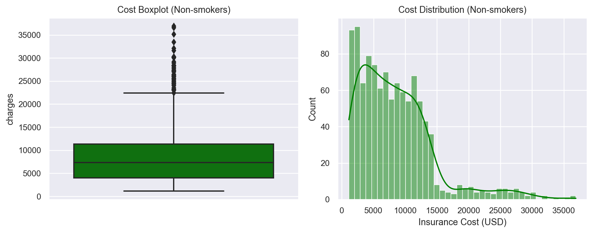
Comparison by Gender (Non-Smokers)
Code
df_male_nonsmoker = df_nonsmokers[df_nonsmokers["sex"] == "male"]
df_female_nonsmoker = df_nonsmokers[df_nonsmokers["sex"] == "female"]

avg_male_nonsmoker = round(df_male_nonsmoker["charges"].mean(), 2)
avg_female_nonsmoker = round(df_female_nonsmoker["charges"].mean(), 2)
print(f"Male Non-smoker Avg: ${avg_male_nonsmoker}")
print(f"Female Non-smoker Avg: ${avg_female_nonsmoker}")

df_both_means = pd.DataFrame({
    'Sex': ['Male', 'Female'],
    'AvgCharges': [avg_male_nonsmoker, avg_female_nonsmoker]
})

plt.figure(figsize=(5,4))
sns.barplot(data=df_both_means, x='Sex', y='AvgCharges', palette='Set2')
plt.title("Non-smoker Avg Charges by Sex")
plt.ylabel("Average Insurance Cost (USD)")
plt.show()
Male Non-smoker Avg: $8087.2
Female Non-smoker Avg: $8762.3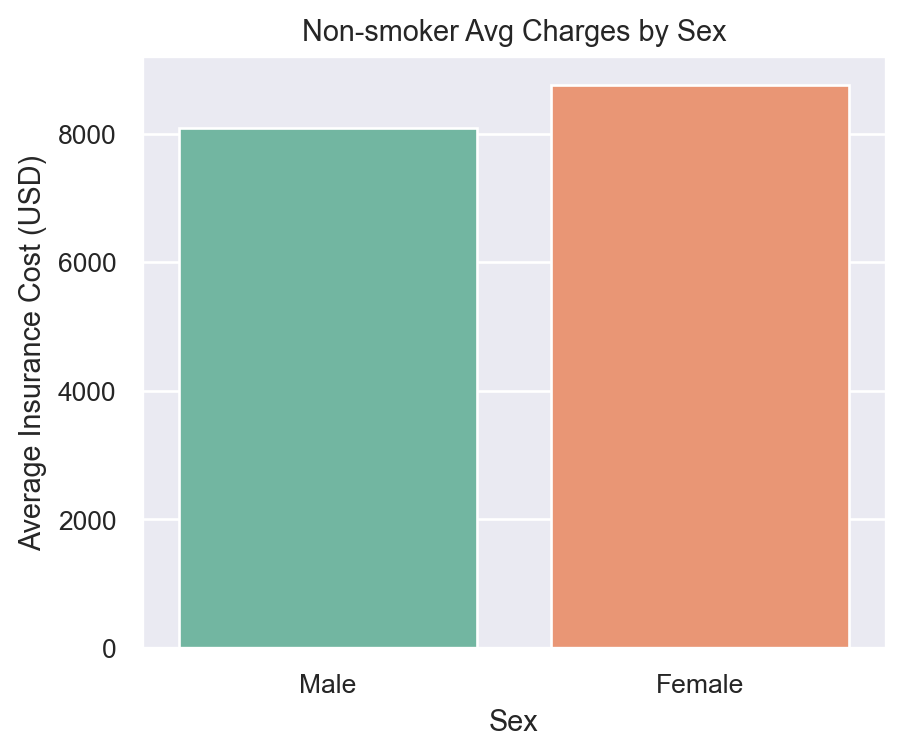
Correlation Heatmap
To quickly see how numeric variables (like age, bmi, children, charges) relate to each other, we can look at a correlation heatmap.
Code
# Select only numeric columns
df_numeric = df[["age", "bmi", "children", "charges"]].copy()

corr_matrix = df_numeric.corr()
plt.figure(figsize=(6,5))
sns.heatmap(corr_matrix, annot=True, cmap="magma", fmt=".2f")
plt.title("Correlation Heatmap of Numeric Features")
plt.show()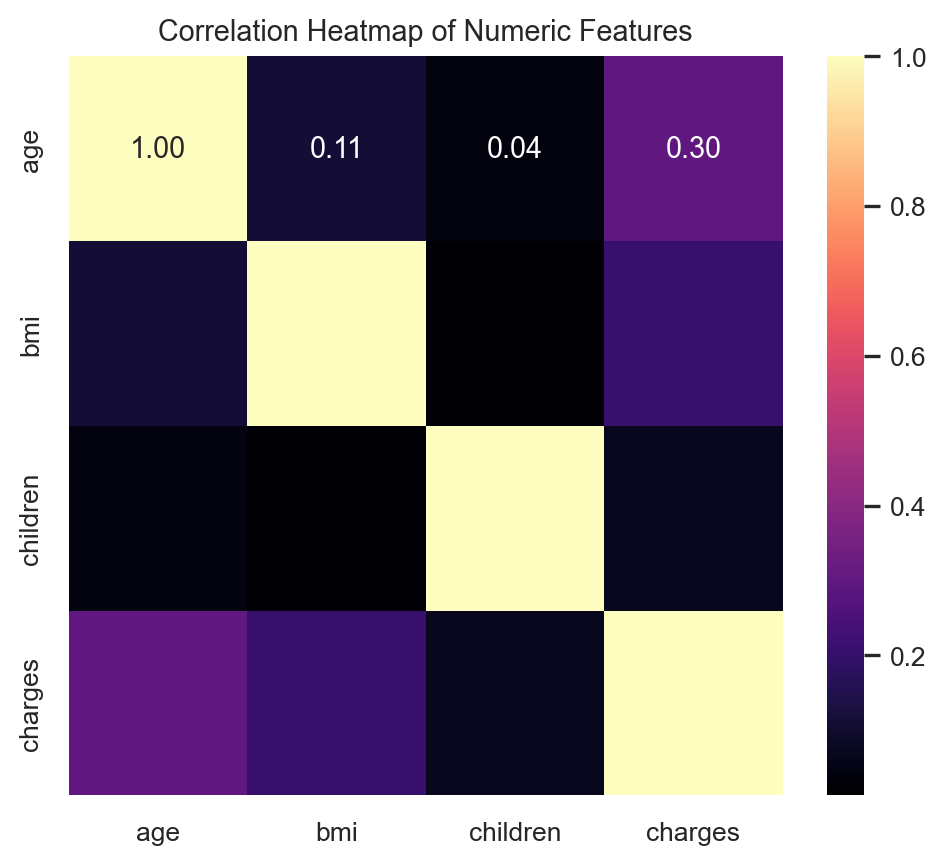
Takeaways: - There’s a moderate positive correlation between age and charges, as well as bmi and charges.
- Children has a mild correlation with charges.
- This quick analysis suggests that age and BMI might be strong predictors of insurance cost (which also aligns with the earlier analyses).
Results
- Smoking Impact: Male and female smokers have significantly higher costs than non-smokers. Once BMI reaches 30 or higher, that cost inflates further.
- Gender Differences: Among smokers with BMI < 30, men pay slightly more on average. For those with BMI >= 30, women pay marginally more.
- Age and Children: Costs generally rise with age; having more children is associated with higher costs among non-smokers, though there are some nuances.
- Correlation: A heatmap reveals that age, BMI, and number of children all have positive associations with charges, with age and BMI showing the strongest correlation.
Conclusion
Our analysis demonstrates the profound impact of smoking and high BMI on health insurance costs. Age is a steady contributor to increased premiums, while having multiple children also shows mild cost elevations for non-smokers. These findings highlight the importance of preventive healthcare and lifestyle interventions.
Moving forward, applying machine learning methods or deeper statistical modeling (e.g., linear or logistic regression) could refine these conclusions and more accurately predict costs. This lays groundwork for broader health insurance strategies, encouraging healthier choices while clarifying how demographic and lifestyle factors compound to drive premiums upward.