
Abstract
Since 1980, healthcare costs in the United States have been consistently increasing across all categories. Various factors contribute to this rise, such as population growth and higher wages for doctors. This report examines expenditure trends from 1980 to 2005, extending up to 2014. The findings reveal an unprecedented surge in healthcare costs across every sector in the United States. Consequently, this report sheds light on the reasons behind the country’s reputation as one of the world’s most expensive nations in terms of healthcare.
Introduction
Healthcare plays a crucial role in our lives, providing essential support for our well-being and longevity. However, healthcare spending continues to soar annually. This report uncovers the alarming reality of escalating healthcare expenditure, presenting a visual representation of each component. It explores overall national spending and delves into individual categories, demonstrating the persistent upward trend in healthcare costs.
Background
The dataset utilized for this report is titled “US Healthcare Spending Per Capita” and was obtained from Kaggle. The dataset’s format posed a challenge, as it followed a wide format with numerous columns and few rows. Notably, the years were presented in the format “Y####,” initially impeding analysis. However, by employing pivoting techniques and manipulating the strings, the dataset was transformed, enabling comprehensive analysis. The subsequent section outlines the complete step-by-step process.
Methodology
To begin, it is essential to assess whether the data is in a “wide” or “long” format. This involves examining the number of rows and columns to facilitate necessary data wrangling.
Make sure to use RStudio’s version 2023.12.1 or higher
# A tibble: 5 × 42
   Code Item     Group Region_Number Region_Name State_Name  Y1980  Y1981  Y1982
  <dbl> <chr>    <chr>         <dbl> <chr>       <chr>       <dbl>  <dbl>  <dbl>
1     1 Persona… Unit…             0 United Sta… <NA>       216977 251789 283073
2     1 Persona… Regi…             1 New England <NA>        12960  14845  16759
3     1 Persona… Regi…             2 Mideast     <NA>        43479  49604  55406
4     1 Persona… Regi…             3 Great Lakes <NA>        40658  46668  51440
5     1 Persona… Regi…             4 Plains      <NA>        16980  19682  21919
# ℹ 33 more variables: Y1983 <dbl>, Y1984 <dbl>, Y1985 <dbl>, Y1986 <dbl>,
#   Y1987 <dbl>, Y1988 <dbl>, Y1989 <dbl>, Y1990 <dbl>, Y1991 <dbl>,
#   Y1992 <dbl>, Y1993 <dbl>, Y1994 <dbl>, Y1995 <dbl>, Y1996 <dbl>,
#   Y1997 <dbl>, Y1998 <dbl>, Y1999 <dbl>, Y2000 <dbl>, Y2001 <dbl>,
#   Y2002 <dbl>, Y2003 <dbl>, Y2004 <dbl>, Y2005 <dbl>, Y2006 <dbl>,
#   Y2007 <dbl>, Y2008 <dbl>, Y2009 <dbl>, Y2010 <dbl>, Y2011 <dbl>,
#   Y2012 <dbl>, Y2013 <dbl>, Y2014 <dbl>, …
[1] "Code" "Item"
[3] "Group" "Region_Number"
[5] "Region_Name" "State_Name"
[7] "Y1980" "Y1981"
[9] "Y1982" "Y1983"
[11] "Y1984" "Y1985"
[13] "Y1986" "Y1987"
[15] "Y1988" "Y1989"
[17] "Y1990" "Y1991"
[19] "Y1992" "Y1993"
[21] "Y1994" "Y1995"
[23] "Y1996" "Y1997"
[25] "Y1998" "Y1999"
[27] "Y2000" "Y2001"
[29] "Y2002" "Y2003"
[31] "Y2004" "Y2005"
[33] "Y2006" "Y2007"
[35] "Y2008" "Y2009"
[37] "Y2010" "Y2011"
[39] "Y2012" "Y2013"
[41] "Y2014" "Average_Annual_Percent_Growth"Earlier, we noticed that the dataset had a wide format, which means the years were in separate columns. To make it easier to analyze, we rearranged the data using a special technique. We combined the year columns into a single “Year” column and placed their corresponding values in a new column called “Cost.”
We also made some adjustments to the “Year” column by removing a specific symbol and converting it to numbers. This way, we can work with the years as numeric values instead of text.
Additionally, we transformed certain columns into categories, which help us group and analyze the data more effectively. These categories include “Item,” “Region_Name,” “Group,” and “State_Name.”
Finally, we selected specific columns, including “Item,” “Region_Name,” “State_Name,” “Year,” and “Cost,” to focus on for further analysis. This will provide us with a clearer understanding of the data.
# A tibble: 6 × 5
  Item                 Region_Name   State_Name  Year   Cost
  <fct>                <fct>         <fct>      <dbl>  <dbl>
1 Personal Health Care United States <NA>        1980 216977
2 Personal Health Care United States <NA>        1981 251789
3 Personal Health Care United States <NA>        1982 283073
4 Personal Health Care United States <NA>        1983 311677
5 Personal Health Care United States <NA>        1984 341645
6 Personal Health Care United States <NA>        1985 376376
Rising Health Care Costs
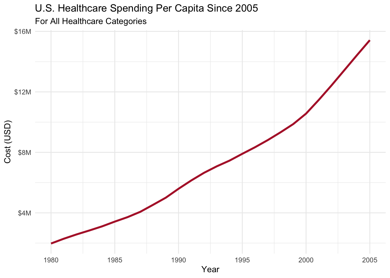
Let’s jump right into the first visualization. It’s evident that healthcare spending has been consistently increasing and shows no signs of slowing down. This graph focuses on the years 1980 to 2005, highlighting the era of escalating healthcare costs.
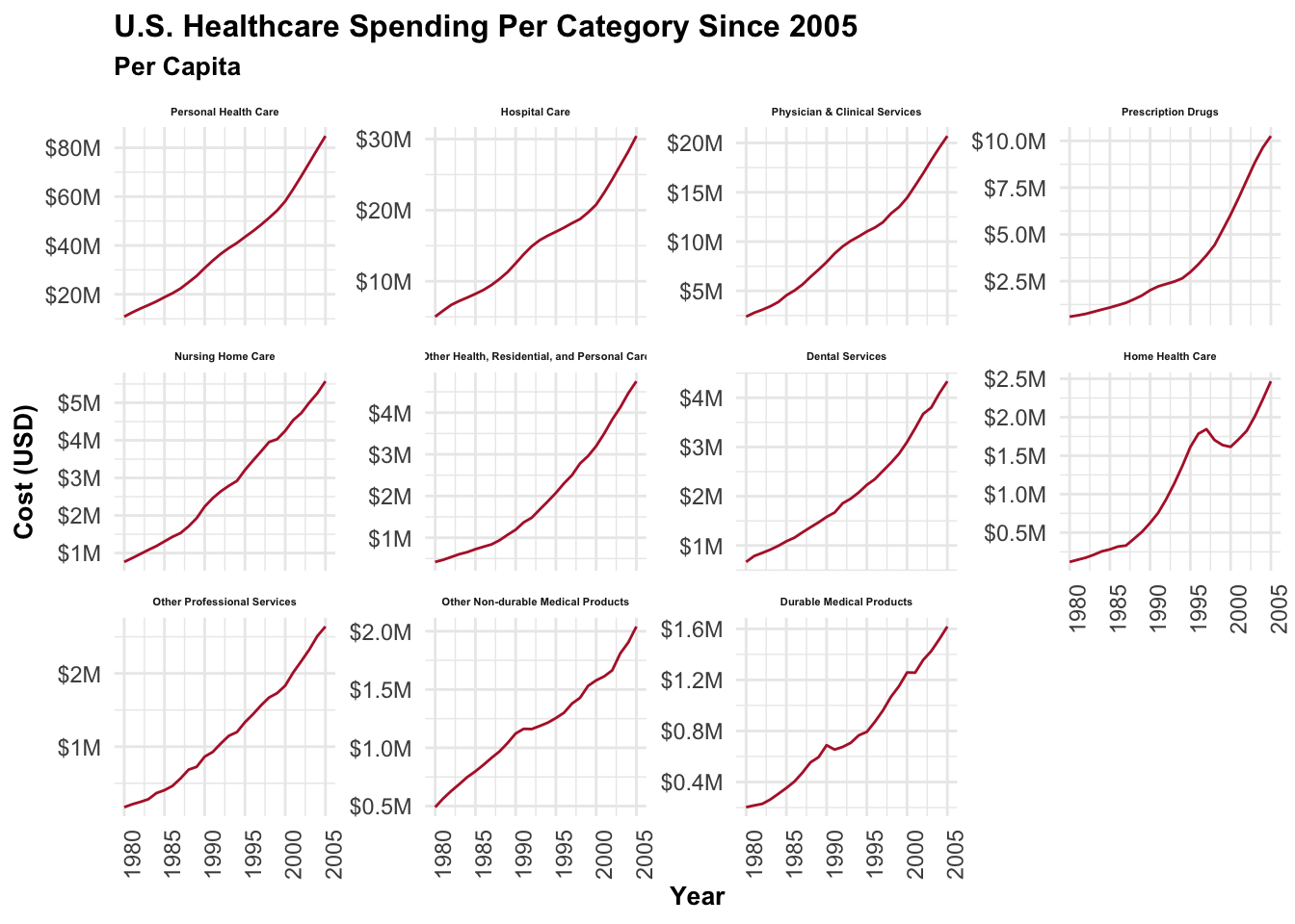
Dominant Spending Categories: Personal, Hospital, and Physician & Clinical Care
Wow! Personal health care expenses skyrocketed from around $10K to nearly $80K within a relatively short period. Both Hospital and Clinical Care play significant roles in healthcare spending. Surprisingly, all three categories follow a similar upward trend, which reveals some unsettling information.
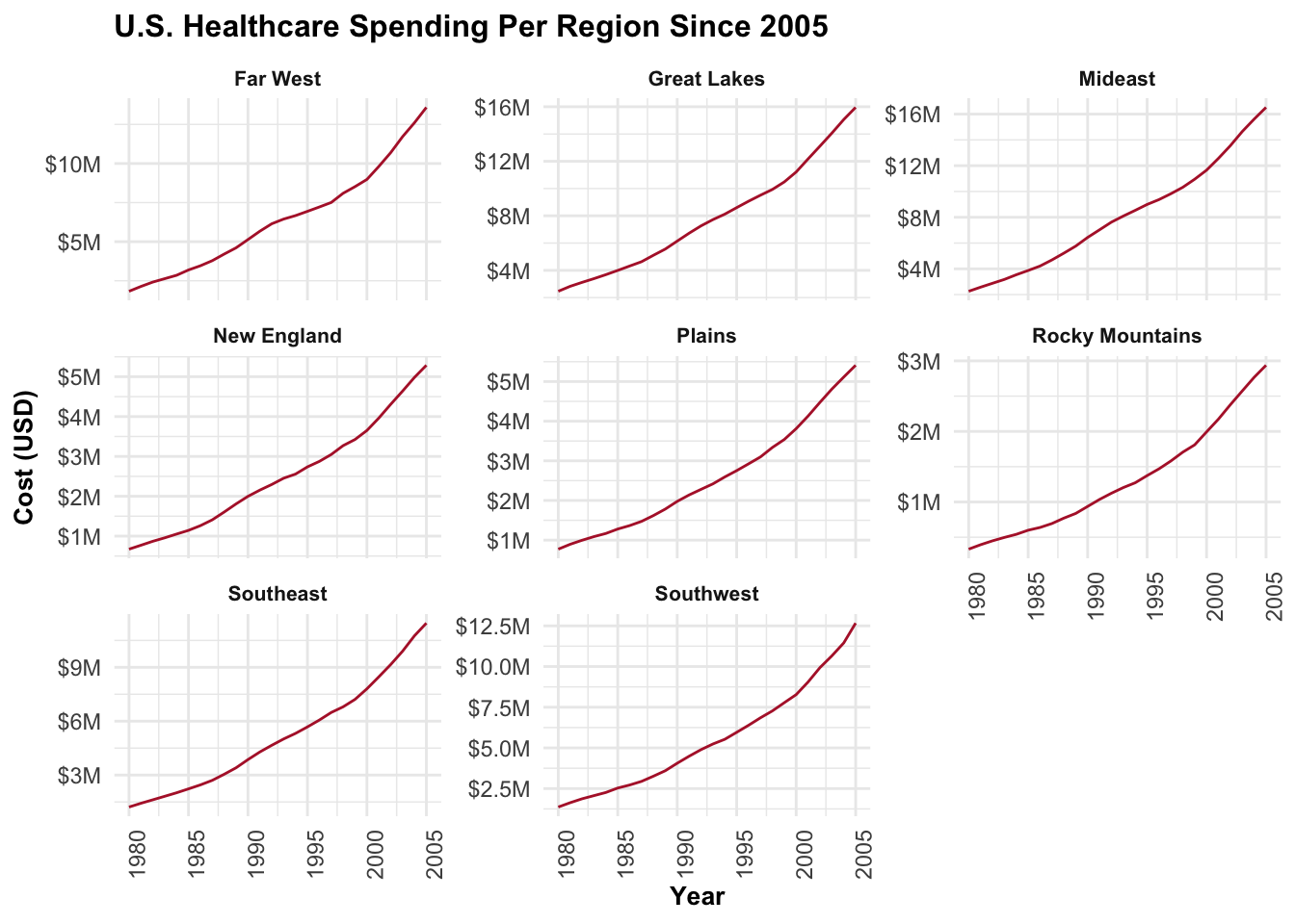
Consistent Trends Across Regions
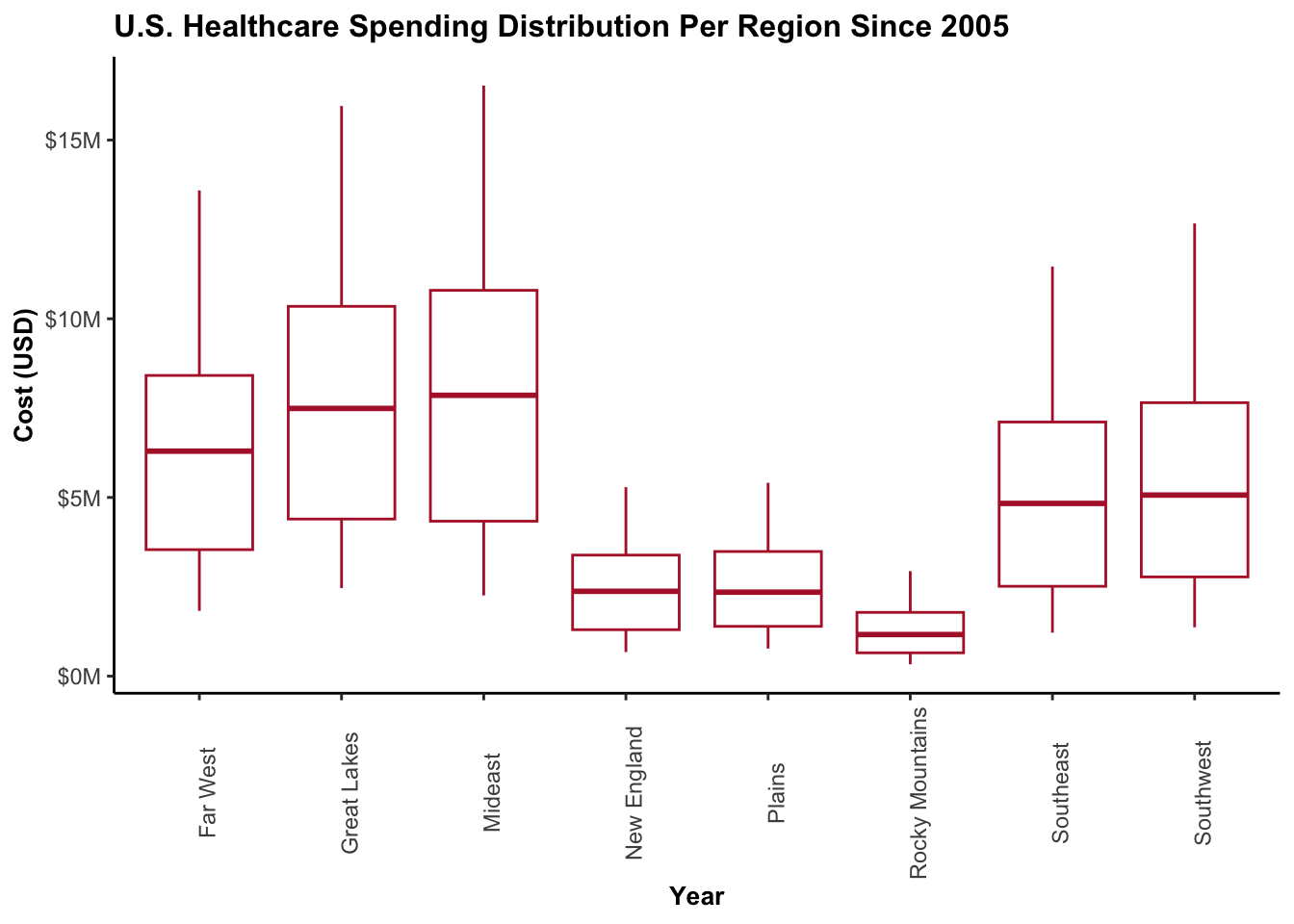
It’s disheartening to report that every region has been experiencing relentless growth in healthcare spending. The trend lines for each region are strikingly similar and proportionate to one another. Notably, the Mideast stands out as the most expensive region, while the Rocky Mountains region appears to have comparatively lower healthcare costs. It’s important to note that this analysis considers spending up to 2005, and we can hope for potential changes by 2014.
Persistent Trends: Rising Healthcare Spending Across U.S. Regions
The bar chart vividly demonstrates the ongoing trends in healthcare spending across different regions. Notably, the Plains, New England, and the Rocky Mountains regions emerge as some of the lowest in terms of medical funding. Surprisingly, their costs can be as low as one-third compared to the most expensive regions. This stark contrast highlights the significant disparities in healthcare expenditure throughout the United States.
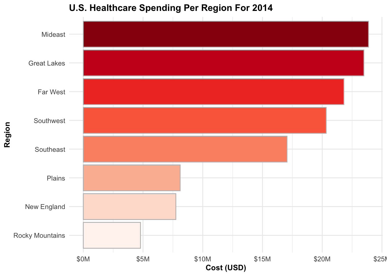
Far West: A Surprising 3rd Place in Healthcare Spending
In 2014, the Far West region experienced a significant surge in healthcare spending, landing them in the 3rd position. This unexpected leap challenges the assumption that states within this region are heavy spenders. However, the subsequent graphic reveals an intriguing revelation that contradicts this perception.
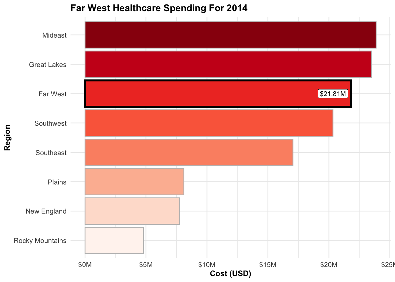
[1] "$21.81M"Oregon: 3rd Place, but Don’t Be Deceived!
Surprisingly, Oregon ranks 3rd in healthcare spending. However, let’s not overlook the undeniable fact that California claims the top spot. The massive population size of California is a significant contributing factor to its high expenditure. Although this report doesn’t delve into the specific reasons, it’s plausible that further analysis would align the Far West region more closely with the spending patterns observed in the Plains or New England regions.
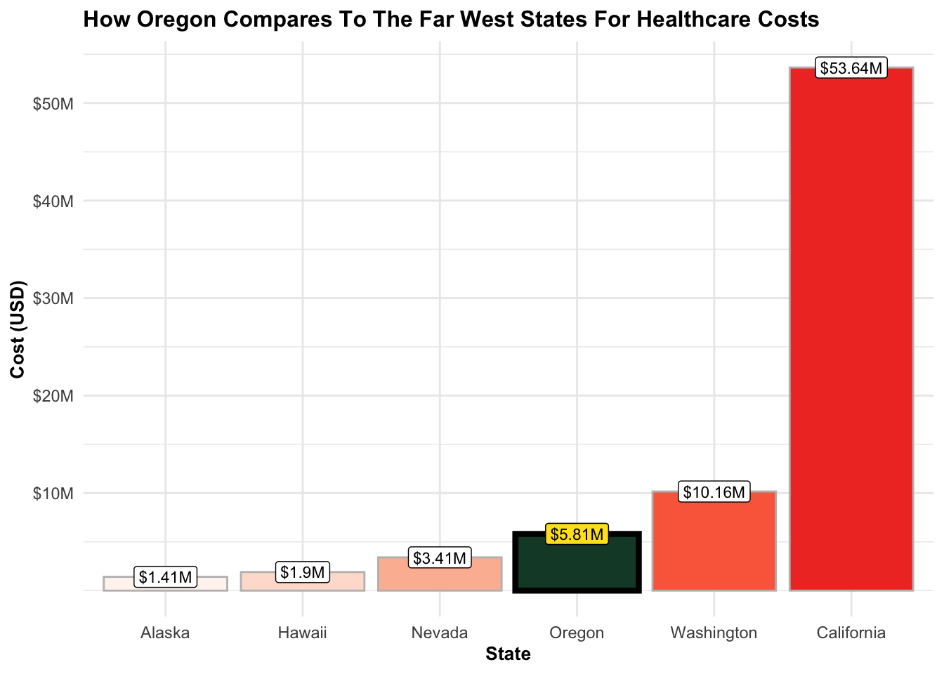
[1] "$1.41M"  "$53.64M" "$1.9M"   "$3.41M"  "$5.81M"  "$10.16M"
[1] "$5.81M"
Inappropriate Model: Linear Fit Inadequate for the Data
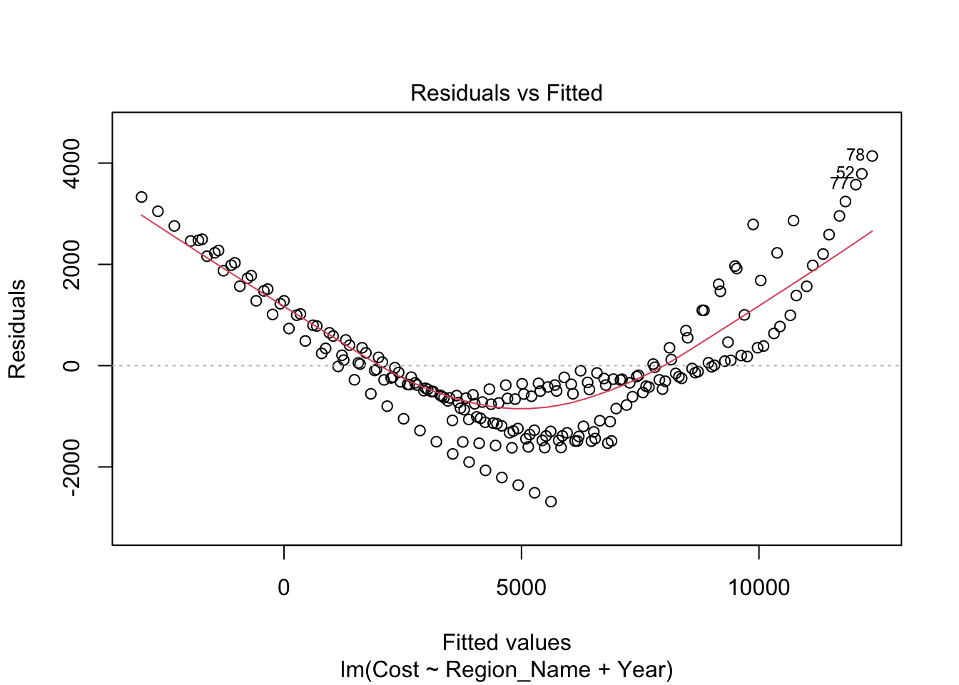
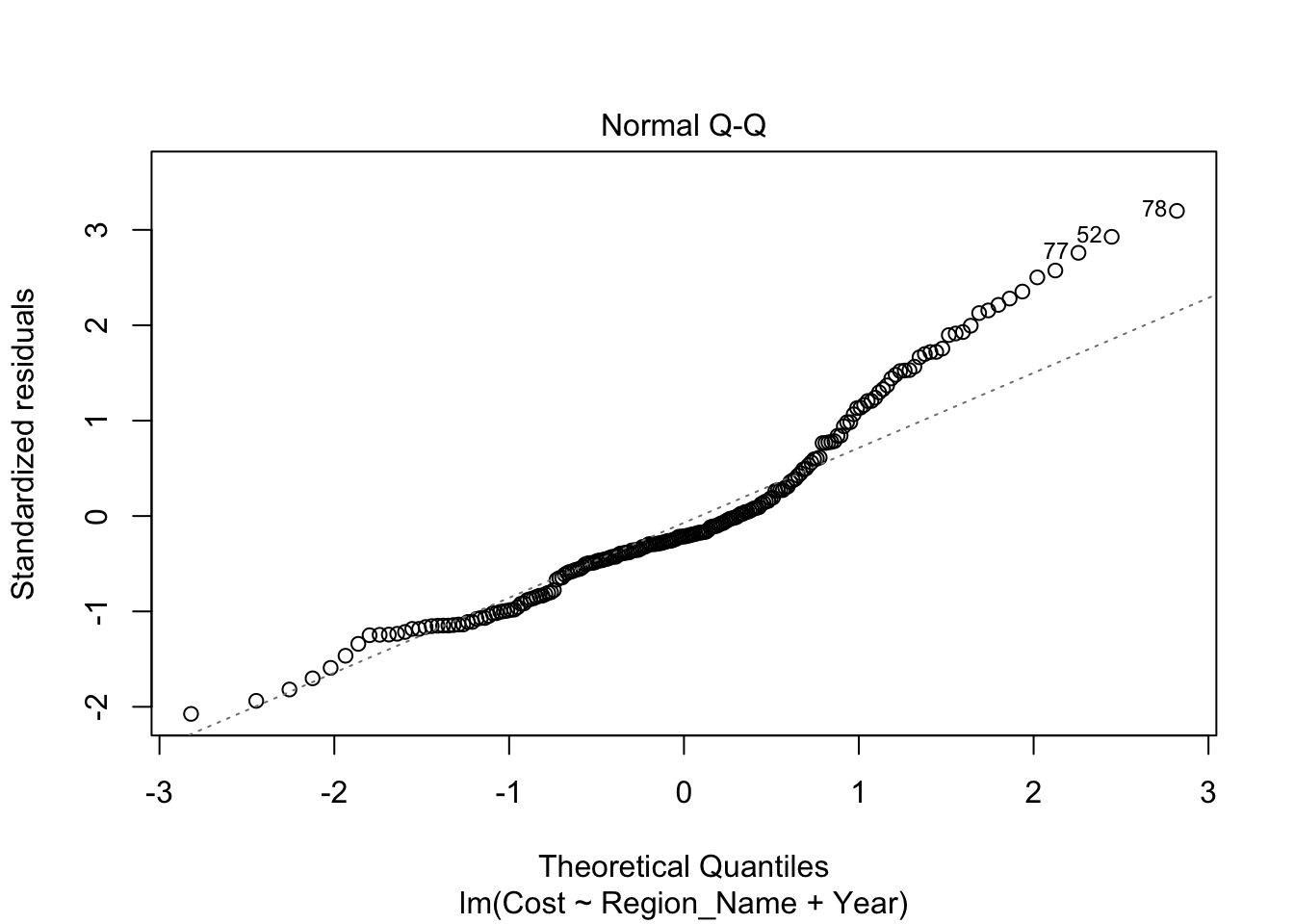
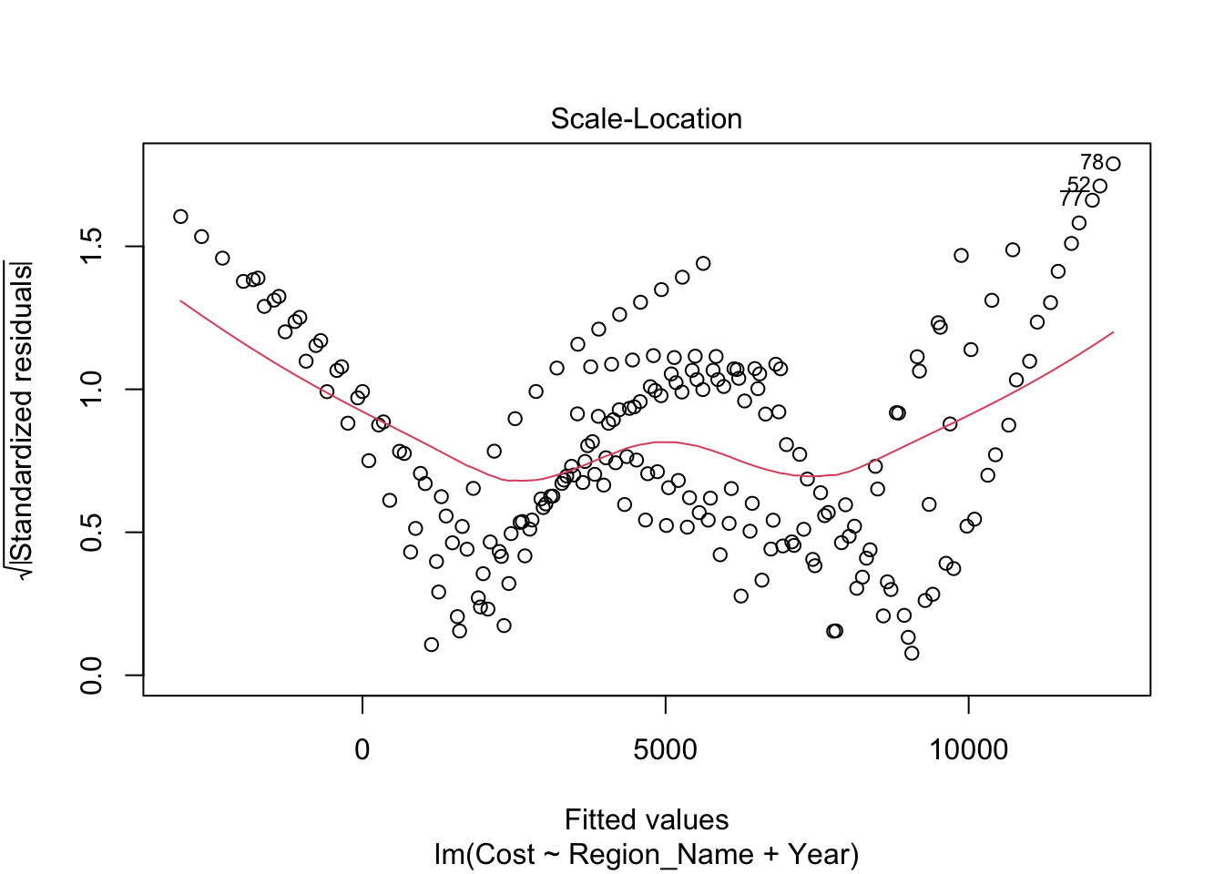
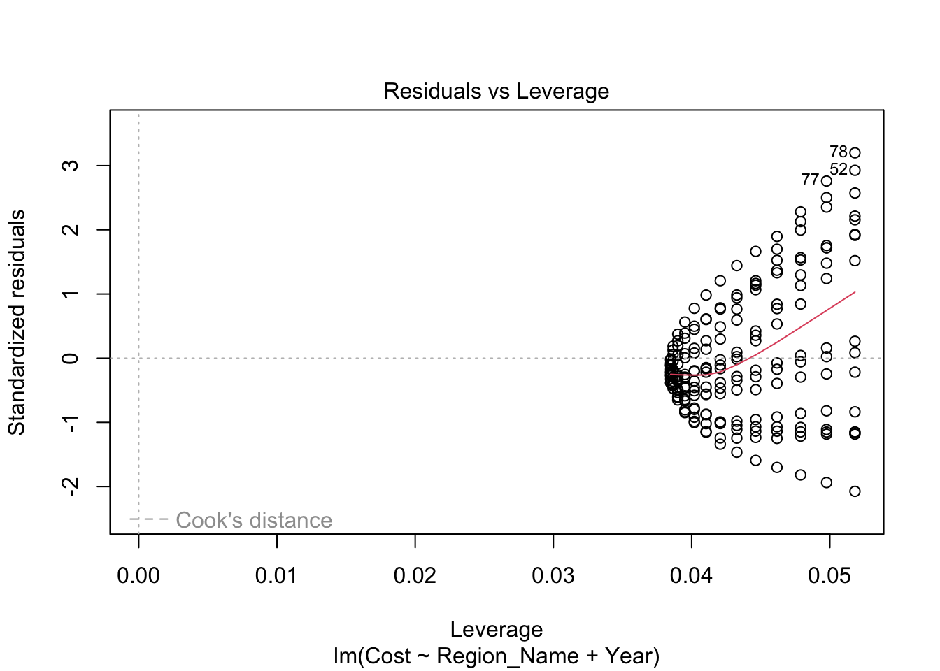
At first glance, the model may seem impressive with an adjusted R-squared value of 0.8572. However, this is deceptive. It’s crucial to note that this model is highly inaccurate and strongly discouraged. The analysis reveals no correlation between Cost and Region_Name per Year, a finding consistent with the filtered dataset covering the years 1980 to 2014.
The residual plots provide clear evidence against a linear fit. The Residuals vs Fitted plot indicates a clear quadratic relationship rather than a linear one. The Q-Q plot deviates from linearity, exhibiting multiple curves along the fitted line. Additionally, the scale-location plot highlights that this model is fundamentally unsuitable for the data.
It is evident that a linear fit is not the appropriate choice for accurately modeling this dataset.
      1
11072.4
Call:
lm(formula = Cost ~ Region_Name + Year, data = regionHealthCareSince2005)

Residuals:
    Min      1Q  Median      3Q     Max
-2683.8  -782.9  -279.8   597.7  4139.3

Coefficients:
                             Estimate Std. Error t value Pr(>|t|)
(Intercept)                -680650.41   24479.29 -27.805  < 2e-16 ***
Region_NameGreat Lakes        1438.65     368.55   3.904 0.000130 ***
Region_NameMideast            1657.50     368.55   4.497 1.17e-05 ***
Region_NameNew England       -3909.68     368.55 -10.608  < 2e-16 ***
Region_NamePlains            -3830.75     368.55 -10.394  < 2e-16 ***
Region_NameRocky Mountains   -5106.26     368.55 -13.855  < 2e-16 ***
Region_NameSoutheast         -1231.18     368.55  -3.341 0.000998 ***
Region_NameSouthwest          -849.93     368.55  -2.306 0.022133 *
Year                           344.83      12.29  28.069  < 2e-16 ***
---
Signif. codes:  0 '***' 0.001 '**' 0.01 '*' 0.05 '.' 0.1 ' ' 1

Residual standard error: 1329 on 199 degrees of freedom
Multiple R-squared:   0.88, Adjusted R-squared:  0.8752
F-statistic: 182.4 on 8 and 199 DF,  p-value: < 2.2e-16
Df Sum Sq Mean Sq F value Pr(>F)
Region_Name 7 1.185e+09 1.693e+08 95.9 <2e-16 ***
Year 1 1.391e+09 1.391e+09 787.9 <2e-16 ***
Residuals 199 3.514e+08 1.766e+06
---
Signif. codes: 0 '***' 0.001 '**' 0.01 '*' 0.05 '.' 0.1 ' ' 1Significant Differences in Means among Regions
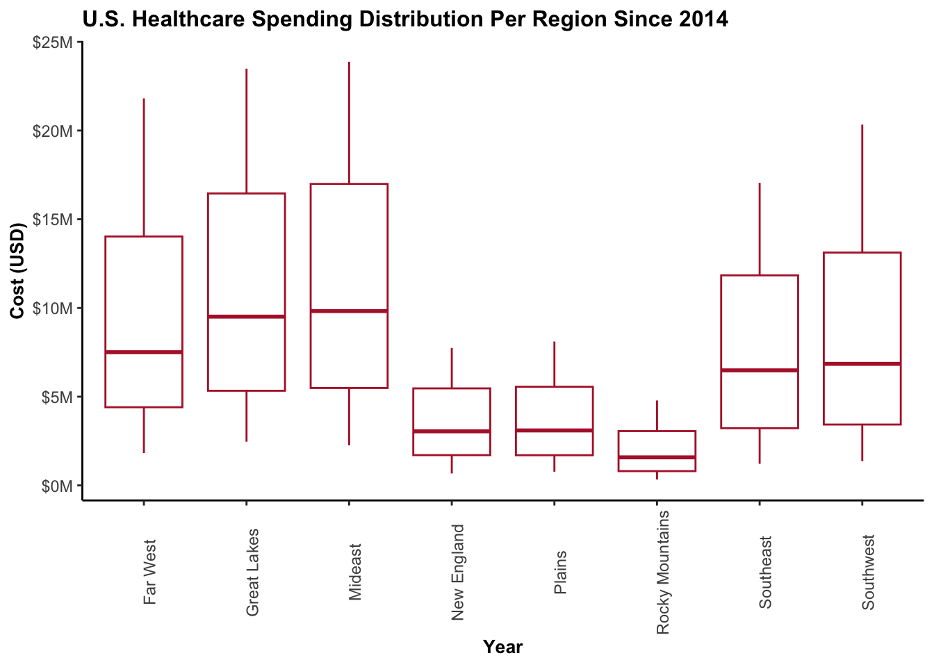
My objective was to investigate whether there were significant differences in the means of each region’s spending over the years. To start, I utilized the LeveneTest to examine the importance of variance (i.e., the spread of spending) across regions. Both tests yielded remarkably small p-values, indicating that three regions had substantially different variances compared to the others.
Building on this, I employed the TukeyHsd test to confirm if these differing variances were reflected in the means. As anticipated from the LeveneTest results, the means of these regions indeed exhibited significant differences. Notably, New England, Plains, and Rocky Mountains had considerably lower average spending. However, despite their comparatively lower spending, these regions still followed the overall growth trend, with an increase of 18% since 2005.
[1] "The Average Spending In The Expensive Regions since 2005 = $5333.29"[1] "The Average Spending In The Expensive Regions since 2014= $7724.45"[1] "Difference: +$2391.16 | Percentage Increase: +18.31%"[1] "The Average Spending In The Cheap Regions since 2005 = $2173.22"[1] "The Average Spending In The Cheap Regions since 2014= $3142.21"[1] "Difference: +$968.99 | Percentage Increase: 18.23%"Levene's Test for Homogeneity of Variance (center = mean)
Df F value Pr(>F)
group 7 12.03 8.727e-13 ***
200
---
Signif. codes: 0 '***' 0.001 '**' 0.01 '*' 0.05 '.' 0.1 ' ' 1Levene's Test for Homogeneity of Variance (center = median)
Df F value Pr(>F)
group 7 11.462 3.292e-12 ***
200
---
Signif. codes: 0 '***' 0.001 '**' 0.01 '*' 0.05 '.' 0.1 ' ' 1Levene's Test for Homogeneity of Variance (center = mean)
Df F value Pr(>F)
group 7 19.546 < 2.2e-16 ***
272
---
Signif. codes: 0 '***' 0.001 '**' 0.01 '*' 0.05 '.' 0.1 ' ' 1Levene's Test for Homogeneity of Variance (center = median)
Df F value Pr(>F)
group 7 12.828 3.075e-14 ***
272
---
Signif. codes: 0 '***' 0.001 '**' 0.01 '*' 0.05 '.' 0.1 ' ' 1 Df Sum Sq Mean Sq F value Pr(>F)
Region_Name 7 1.185e+09 169337440 19.43 <2e-16 ***
Residuals 200 1.743e+09 8712933
---
Signif. codes: 0 '***' 0.001 '**' 0.01 '*' 0.05 '.' 0.1 ' ' 1 Tukey multiple comparisons of means
95% family-wise confidence level
Fit: aov(formula = Cost ~ Region_Name, data = regionHealthCareSince2005)
$Region_Name
diff lwr upr p adj
Great Lakes-Far West 1438.64777 -1069.19906 3946.4945990 0.6495584
Mideast-Far West 1657.50100 -850.34583 4165.3478291 0.4679930
New England-Far West -3909.68132 -6417.52815 -1401.8344885 0.0000930
Plains-Far West -3830.75287 -6338.59970 -1322.9060420 0.0001417
Rocky Mountains-Far West -5106.25783 -7614.10466 -2598.4109954 0.0000001
Southeast-Far West -1231.18113 -3739.02796 1276.6657036 0.8046614
Southwest-Far West -849.92577 -3357.77260 1657.9210559 0.9679983
Mideast-Great Lakes 218.85323 -2288.99360 2726.7000602 0.9999950
New England-Great Lakes -5348.32909 -7856.17592 -2840.4822574 0.0000000
Plains-Great Lakes -5269.40064 -7777.24747 -2761.5538109 0.0000000
Rocky Mountains-Great Lakes -6544.90559 -9052.75242 -4037.0587643 0.0000000
Southeast-Great Lakes -2669.82890 -5177.67573 -161.9820653 0.0279871
Southwest-Great Lakes -2288.57354 -4796.42037 219.2732870 0.1019616
New England-Mideast -5567.18232 -8075.02915 -3059.3354875 0.0000000
Plains-Mideast -5488.25387 -7996.10070 -2980.4070410 0.0000000
Rocky Mountains-Mideast -6763.75882 -9271.60565 -4255.9119944 0.0000000
Southeast-Mideast -2888.68213 -5396.52896 -380.8352954 0.0119419
Southwest-Mideast -2507.42677 -5015.27360 0.4200569 0.0500724
Plains-New England 78.92845 -2428.91838 2586.7752767 1.0000000
Rocky Mountains-New England -1196.57651 -3704.42334 1311.2703233 0.8267302
Southeast-New England 2678.50019 170.65336 5186.3470223 0.0270977
Southwest-New England 3059.75554 551.90871 5567.6023746 0.0058329
Rocky Mountains-Plains -1275.50495 -3783.35178 1232.3418768 0.7745369
Southeast-Plains 2599.57175 91.72492 5107.4185757 0.0361922
Southwest-Plains 2980.82710 472.98027 5488.6739280 0.0081616
Southeast-Rocky Mountains 3875.07670 1367.22987 6382.9235291 0.0001119
Southwest-Rocky Mountains 4256.33205 1748.48522 6764.1788814 0.0000135
Southwest-Southeast 381.25535 -2126.59148 2889.1021825 0.9997829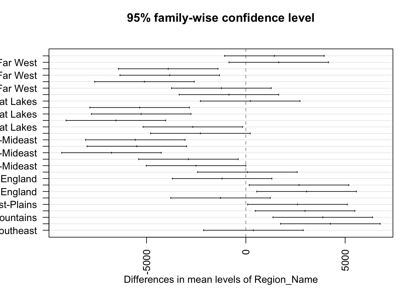
Results
The cost of healthcare in the United States has increased more than fivefold between 1980 and 2014. Across regions, there is a consistent upward trend in healthcare spending with no clear indications of a decrease. Although some regions are less expensive than others, their growth rates align with the national average. Personal health care spending, which averaged around $10,000 in 1980, has significantly risen to nearly $80,000 in 2014.
As of 2014, the Mideast, Great Lakes, and Far West regions rank as the top three most expensive regions, while the Rocky Mountains, New England, and Plains regions are the least expensive.
Within the Far West region, Oregon stands out as the third most expensive state.
Conclusion
The United States continues to experience escalating healthcare expenditures, raising concerns about the affordability of personal health care. The substantial increase of approximately $70,000 over a span of 35 years far exceeds inflation expectations. It would have been beneficial to have inflation-adjusted values in the dataset, allowing for a more comprehensive analysis and deeper insights.
Further exploration can be done to investigate potential statistical significance between individual states and their spending patterns. This avenue remains open for future researchers to delve into for a more in-depth understanding of healthcare expenditure variations.